
- Custom Banners
- Advertising Banners
- Anniversary Banners
- Band Banners
- Birthday Banners
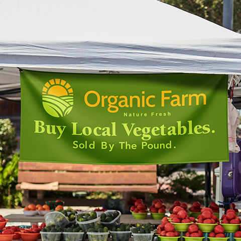
- Business Banners
- Church Banners
- Contractor Banners
- Graduation Banners
- Military Banners
- Party Banners
- Photo Banners
- Political Banners
- Real Estate Banners
- Restaurant Banners
- Retail & Sale Banners
- School & Classes Banners
- Sponsor Banners
- Sports Banners
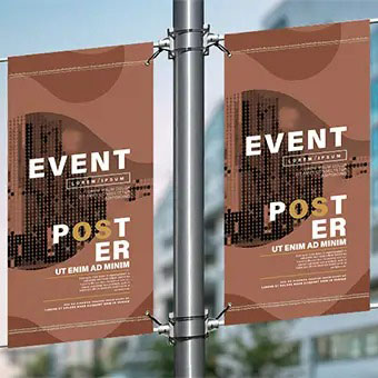
- Vertical Hanging Banners
- We're Open Banners
- Step & Repeat
- Mesh Banners
- Retractable Banners
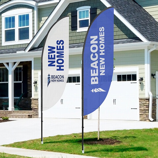
- Flags
- Fabric Banners
- X-Banners
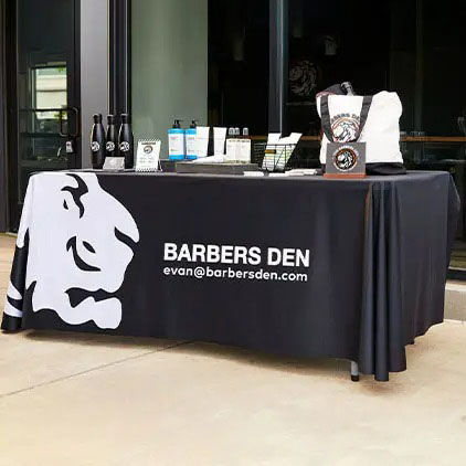
- Tablecloths
- Yard Signs
- More Products
- More Products
- Hardware & Accessories
- Custom Banners
- Advertising Banners
- Anniversary Banners
- Band Banners
- Birthday Banners
- Business Banners
- Church Banners
- Contractor Banners
- Graduation Banners
- Military Banners
- Party Banners
- Photo Banners
- Political Banners
- Real Estate Banners
- Restaurant Banners
- Retail & Sale Banners
- School & Classes Banners
- Sponsor Banners
- Sports Banners
- Vertical Hanging Banners
- We're Open Banners
- Step & Repeat
- Mesh Banners
- Retractable Banners
- Flags
- Fabric Banners
- X-Banners
- Tablecloths
- Yard Signs
- More Products
- More Products
- Hardware & Accessories
Indoor Banners and Outdoor Banner Design Tips
Keeping the Design Line
Tips for Creating Attractive Banners
When designing outdoor vinyl banners and indoor banners for your business, it's best to keep a clear, attractive design that is simple and easy to read. However, the rules are different depending on the placement, size and location of the banner. Following these tips for outdoor and indoor banners will bring your business positive attention.
Designing Outdoor Vinyl Banners
It can be easy to get carried away in elaborate designs and color combinations when creating the outdoor banners that bring customers into your store. However, flashy is not always the best choice to make. The first step for outdoor vinyl banners is making signs that are easy to read in a few moments. According to the Outdoor Advertising Association of America, the best color combinations include black on yellow, black on white, yellow on black and white on blue. If you want to highlight certain information, like your phone number or web site, use a different color. Studies at the Pennsylvania College of Optometry found that drawing extra attention in this way increases the likelihood it will be remembered by 78%.
The placement and location of the outdoor banner also plays an important part in the design process. Most yard signs are promoted in front of the business near a street where drivers and passengers only catch a quick glimpse. Keeping the text as brief and concise as possible will help them remember your message. Since weather and wind are factors for outdoor banners, keep these in mind when deciding the best location. Using durable outdoor banner stands along with the strong vinyl material will keep the message out front longer for all to see.
Tips for Indoor Banners
Creating indoor banners allows more design freedom since the customer has more time to read. However, most people lose focus quickly, so it's important to make the banner attractive and not too lengthy. The first two factors to consider are the size and shape. Research shows that people are most likely to be drawn to the center of the banner, so the most relevant information should be placed there. Attractive, clear photographs or graphics of products should be used along with a small amount of positive language describing them.
Unlike outdoor banners, high-impact colors are not recommended for indoor signs. Instead, a more relaxed design of light color backgrounds will keep the customers eyes focused longer. The traditional design of black text on a white background is clean and simple with blocks of text no longer than 75 words, or two to three sentences.
It's not necessary to have a degree in graphic design to create appealing signs for your business. Using these simple design tips (and our easy banner design tool), you can create indoor and outdoor banners that get your message across and passed along to others.